Website & app revamp along with change in tech platform
Responsive
Conversion
UX Design
Stakeholder collaboration
App
Web
Checkout
41%
Increase in transaction growth, performing well above expected range
29%
Increase in year on year revenue growth after launch
Lyca Mobile, a prominent British mobile virtual network operator (MVNO), spans its services across 18 countries. The company has carved a niche in providing international Pay-as-you-go SIM cards. Focused on delivering affordability and reliability, Lyca Mobile offers a variety of plans designed to suit diverse needs. These plans feature generous data allowances, unlimited calls and texts, and international calling options, empowering customers to stay effortlessly connected with loved ones across borders. With a commitment to value and convenience, Lyca Mobile bridges the gap between families and friends worldwide
Lyca Mobile committed a substantial £250 million to embrace cutting-edge technology and revolutionize the user interface and experience for its 15+ million customers worldwide. As part of this transformation, a sleek new website design was to be rolled out across its global markets, reaching the UK, Ireland, Germany, Switzerland, Austria, the USA, France, the Netherlands, Belgium, Australia, Denmark, Norway, Sweden, Poland, Italy, Portugal, Spain, and Uganda. This upgrade marks a bold step forward in enhancing connectivity and convenience for users in these regions
To address the issues in the existing website design, the following solutions are proposed:
Enhance user experience (UX): Redesign the navigation to be intuitive and consistent across all pages. Incorporate clear user feedback mechanisms (e.g., hover states, progress indicators) and ensure uniformity in interactions and content presentation. Conduct usability testing to identify pain points and resolve them.
Adopt a harmonious UI Design: Implement a design system to establish visual consistency, including a cohesive color palette, typography, and spacing. Use modern design principles to create an aesthetically pleasing interface.
Implement mobile-first approach: Redesign the website with a mobile-first approach, ensuring responsiveness and optimal performance on smaller screens before scaling up to desktops.
Strengthen brand focus: Align the visual and textual content with the brand identity, including logos, taglines, and tone of voice. Create design elements that reflect the brand's values and personality.
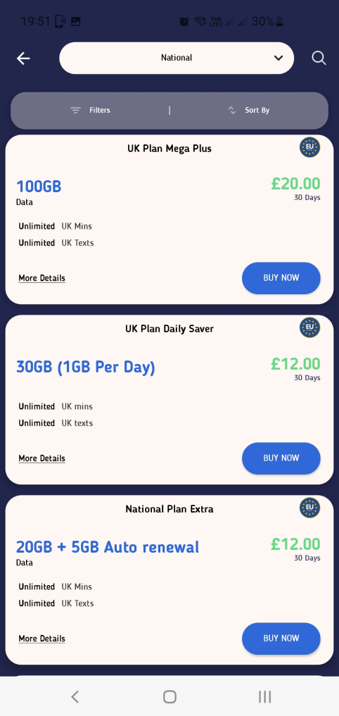
Integrate marketing principles: Optimize for conversions by employing clear calls-to-action (CTAs), persuasive content, and strategic placement of elements to guide user journeys effectively. Leverage SEO and analytics to track and improve performance.
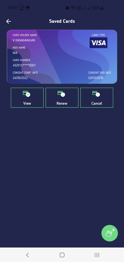
Enable personalisation capabilities: Incorporate features like user accounts, saved preferences, and dynamic content recommendations to deliver personalised experiences.
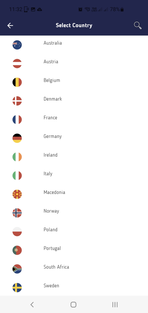
Cater to global markets: Ensure multilingual support, cultural sensitivity in design, and accessibility compliance to reach diverse audiences effectively.These solutions collectively aim to elevate the website’s usability, aesthetics, and alignment with business objectives.
Since I joined the Lyca design team in 2022, I continue to lead the design workstream for all digital channels along with design head. Every day is a new challenge as I need to collaborate with the product owner, acquisition lead, retention lead, country managers(sales), development leads , QA teams and content writers .
As a cross-functional team, we drew a plan to unpack and tackle problems from a user and business perspective, going through an extensive mapping over clashing moments in the user journey, analyzing user needs to understand why a substantial part of our 7 million customers reachs out to Lyca so often, getting back to former research to find existing insights, and benchmarking patterns used by competitors and similar products.
The proposed website for the MVNO will serve as a critical platform to drive customer engagement, streamline operations, and support business growth.
Key objectives include:
Dynamic Updates: Enable real-time changes to pricing and plan details, ensuring responsiveness to market demands and accurate customer information.
Content Agility: Facilitate quick and effortless updates to website content, reducing time-to-market for promotions and announcements.
Multilingual Support: Expand reach by offering seamless language options, catering to diverse customer segments.
Clear Communication of Benefits: Highlight user-centric features and value propositions to simplify decision-making and enhance customer trust.
Marketing Integration: Support creative marketing campaigns through adaptable design and functionality, ensuring effective promotion of offers and services.
With any new transformational change, user will take time to understand the experience, in terms of navigation structure, interaction behaviour and the content. This will lead to increased learning curve. Creating familiarity can be helpful to make users feel-at-home, especially for the first time. That’s why our next step was to have a look at big players and understand the patterns, strategy, benchmarking, so the experience can be leveraged. For the UK market, big players such as Vodafone, EE, O2 and peer players like Giffgaff, Lebara & ID Mobile(MVNO) were constantly referred.
#Insight 1 - Leverage strong retail brand presence to drive digital engagement: Build a site that is basically a physical store in your pocket. By sharing stories, helpful tips, and reminders of why people love the brand, the website becomes just as trustworthy and familiar as the physical store—making it easy for customers to stay connected and engaged anytime, anywhere
#Insight 2 - Streamline key journeys to accelerate sales: Buying a SIM card should be as easy as grabbing your favorite snack at the store—quick and hassle-free. By asking for only the essentials and saving tasks like registration or porting your number for later, the process stays simple and fast. This way, customers can get what they need without unnecessary delays, making it more likely they’ll complete the purchase.
#Insight 3 - Convert paid traffic into happy customers: By creating configurable landing page templates, businesses can target our deal seeking audience effectively. These templates, designed to support both single and group product promotions, ensure consistent branding by reusing key design elements from website checkouts in both form and function. This not only streamlines the purchase process but also builds trust and familiarity
#Insight 4 - Open offers are are primarily created for new customers: Following market best practices, offers and upgrades for existing customers were made accessible exclusively behind a login for a seamless and secure experience
#Insight 1: Leverage brand values for consistency: The design should align with the brand's core value proposition—such as affordable bundles and seamless international calling. By reinforcing these attributes, users can connect with the brand effortlessly. Aim to create an ecosystem that fosters familiarity and trust
#Insight 2 - Incentivize habit change To encourage users to adopt digital solutions, the design must spotlight a diverse range of offers prominently within the product listings. These incentives can help ease the transition and build new digital habits.
#Insight 3 - Cater to varying levels of Digital proficiency: Success hinges on a user-friendly experience. Simplify navigation and streamline the checkout process to make the platform accessible to everyone, regardless of their tech expertise
Streamline monthly recharges: Simplify or automate the recharge process to deliver convenience, driving significant business growth and higher ARPU.
Accommodate offline behaviors: Support a "top-up" feature that allows users to maintain their familiar habits while utilizing stored credit for monthly renewals.
Simplify payments: Expand payment options by integrating newer, more user-friendly methods.
Keep talking to customers: Regularly communicate upgrade offers to ensure users stay connected and informed.
From the market research, current website & app and from understanding the understanding the users, the overall approach to define the design was created.
Keeping in mind there are 16+ countries, the design should also support other countries in terms of reusability with applicable localisation & customisation. Tech platform change will enhance the real-time content update via CMS and also for product or plans via PIM (Product Information Management) catering to business needs.
Based on the business needs & insights gathered in the analogous research and understanding user expectations, few core opportunities emerged.
One of the complexity with legacy experience was the product catalogue catering to both new and existing customers. Kept them separate as per market practice.

One of the key pages is product or plan display, similar to shopfront. Layout is improved with, highlights of the plan, clear display of price & GB data with scalable features and clear call out of action button along with supported terms and conditions.
Recommend add-ons that align with the customer’s primary purchase. For example, if someone buys a bundle, suggest top ups, roaming add ons, or additional data
Display add-ons during checkout or when customers view their cart.
Organized navigation and layouts prioritize key details, making it effortless for users to find and understand plan options.
Intuitive prompts and visual cues ensure users can easily explore plans, select options, and complete purchases without confusion.
Streamlined payment process with secure options ensures quick, hassle-free transactions for an enhanced customer experience.
Build loyalty through referral incentives, personalized follow-ups, and resources to help users maximize their chosen plans.