
Sales increasing post-launch:
A win or a worry?
A case study that emphasises the need to understand user behaviour

A case study that emphasises the need to understand user behaviour
The change in Prepaid strategy
LycaMobile primarily sells prepaid mobile bundles of varying tenures and price points. For new customers, these bundles come with a SIM, while existing customers typically visit the website to renew or upgrade their plans. One of the key business goals was to make the new website acquisition focused wherein all products visible in the website were meant for new customers only. Existing customers would have to key in their number to view deals.Following the launch of a refreshed website in the UK, we observed a significant surge in new customer orders—a promising outcome for the design team.

LycaMobile primarily sells prepaid mobile bundles of varying tenures and price points. For new customers, these bundles come with a SIM, while existing customers typically visit the website to renew or upgrade their plans. One of the key business goals was to make the new website acquisition focused wherein all products visible in the website were meant for new customers only. Existing customers would have to key in their number to view deals.Following the launch of a refreshed website in the UK, we observed a significant surge in new customer orders—a promising outcome for the design team.
Initially, the increase in orders felt like a validation of the new website's success. However, while a slight drop after the initial spike was anticipated, we expected a sustained improvement over the numbers from the old website.
Contrary to expectations, the surge in orders continued at an unusually high rate, raising questions. Soon, customer care reported an alarming trend: Customers complained they had received a new SIM despite intending only to renew their existing bundles. Refund requests began piling up.
The daily count of unintentional purchases reached approximately 160 daily in the UK. Although new customer orders had also increased, the rise in unintended orders posed a serious risk to the company’s reputation. The design team was tasked with investigating the issue and finding a solutionThe good - intended new orders were higher than before as expected
As the design lead, I was accountable for identifying whether changes introduced in the new website caused this issue. The investigation involved collaborating with teams from customer care, product development, and data analytics to ensure a thorough analysis.
One major change involved segmenting journeys for new and existing customers. Previously, both groups encountered the same product listings, differentiated by a pop-up asking their customer type. In the new design:
Exposed to plans with offers, proceed to SIM selection, and checkout.
Required to log in first to access renewal or upgrade options
Consolidating the feedback from customer care team and also numbers from few countries, there was a pattern emerging in terms of why the numbers are increasing.
#Insight 1 - A genuine misunderstanding
Some existing customers mistakenly purchased plans for new customers, assuming these were renewal options
#Insight 2 - The false narrative
The SIM selection step caused confusion, as customers believed they were selecting their current SIM type
The earlier design mirrored competitors’ flows, catering to deal-seeking customers who frequently switch providers. Existing customers familiar with the old system expected visible product listings upon landing on the website
Customer complaints consistently highlighted confusion about receiving a SIM instead of just the plan they intended to purchase.
Customer complaints consistently highlighted confusion about receiving a SIM instead of just the plan they intended to purchase
As the design lead, I was accountable for identifying whether changes introduced in the new website caused this issue. The investigation involved collaborating with teams from customer care, product development, and data analytics to ensure a thorough analysis.
Customers need additional contextual feedback on the choices made during the journey
Customers needed clearer guidance, additional contextual information, and content refinement on key pages
Based on the business needs & insights gathered in the Analogous Research and understanding user expectations, few opportunities emerged

Added notes emphasizing customers would receive a new SIM

Display add-ons during checkout or when customers view their cart.

Product listing pages now highlighted that plans came with a SIM

Updated to “Buy SIM & Plan” from “Buy Now” for clarity
The changes had minimal impact on user behavior. Despite enhanced clarity, many customers still made unintentional purchases!
By now this was really concerning to me and other members involved in the investigation. Though our net new customer base still increased, we were exceptionally curious to find out the reason for the trend.We decided to run a design critique session to run through the purchase flows again. During the session couple of more observations came to light
Based on our insights, we decided to critically look at the information we ask customers to fill out and review customer purchase logs.Analysis of order logs revealed a crucial pattern - The optional mobile number field in the personal details section. Most users filled this field with their Lyca number, assuming it was part of the renewal process.
The field was labeled as optional, designed to gather an alternate contact number to ensure seamless delivery fulfilment. However existing customers did not really notice the ‘optional’ marker(# insight 5) and without that, the mobile number field had always been the first important information they entered before proceeding to checkout.
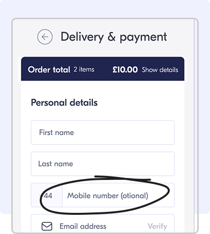
The most obvious thing was to get rid of the optional field but a little more study revealed that it was quite an useful field in many European countries where failed delivery attempts tend to increase the operational cost. Having the number helps the delivery partners succeed in the first attempt
Exposed to plans with offers, proceed to SIM selection, and checkout.
Required to log in first to access renewal or upgrade options
Instead, the field was relocated to the delivery address section, making it contextual to its purpose. Additionally, the operational need of having a mobile number for the purposes of delivery would still be fulfilled

Key learnings
#1 Change takes time
Users need time to adapt to new designs. Repeat customers should be identified and guided with intentional design cues.
#2 Users scan, not read
Users engage with minimal information required to complete their tasks. Designs must anticipate this behavior
#3 Adhere to market practices
Familiar patterns reduce friction. Deviations must be justified by clear business needs and thoroughly tested.
Shout-outs
A huge thanks to everyone involved in this exciting investigation - Designers, Analytics team, Country managers, Customer support team and Development teams


