
Introducing new product line: Pay Monthly
The design process for creating a new product offering & identity

The design process for creating a new product offering & identity
LycaMobile, a market leader in prepaid mobile services with 15 years of expertise and a robust retail presence, is set to expand into the Pay Monthly SIM-only market in the UK. Recognizing the high Average Revenue Per User (ARPU) potential of this segment, LycaMobile aims to address a key market gap: the lack of affordable, value-driven contracts.
After the successful launch of transformative prepaid website & app, design group geared towards launch of postpaid product line. Leveraging the design systems and following the brand guidelines, postpaid experience demanded specific needs.
Configurable Journey Orchestration: Develop a highly adaptable and customisable user journey to accommodate the diverse requirements of different markets, ensuring a seamless and localised customer experience
Collaborative Branding: Partner with Marketing and Brand teams to establish a distinct and compelling identity for the Pay Monthly product, resonating with the target audience
Enhanced UI design: Elevate the current user interface to reflect a premium category, incorporating innovative and sophisticated design elements that align with the product’s positioning
I led the Product Design - User Experience (UX) of this project including acquisitions journeys and self-help modules, while establishing a new visual identity for the product line along with dedicated UI designer. This involved market research and seamless collaboration with key teams, including Product, Pricing, Customer Support, and Marketing
Pay monthly introduces new set of challenges compared to Pay as you go, in terms of product, branding and also new tech systems. Current legacy platform was not exposed to public but limited group including staff.
The first step of the design process involved discussions with country managers and desk research to understand how competitors and users behave. Prior to this I also had an existing platform experience that was not exposed to public. With these inputs and analysis, along with UI designer, I created the concept with the help of wireframes.
With internal validation with country manager and product team, I was able to iterate faster, leading to agreement and development. With specific design guidelines for postpaid, I worked closely with UI designer to focus on design principles such as contrast, hierarchy and feedback; brand attributes; user interactions, and the imagistic universe presented as briefing by the case. For the go to market, the business decided to go with full blown version which offered add-ons and other possible product configuration steps. This would give us an opportunity to test and conclude on the things to retain in our snappier version with tested defaults.
The UK telecom market, led by major players like Vodafone, EE, and O2, inspired our deep dive into their onboarding processes. Our goal was to uncover areas for enhancement while adhering to industry benchmarks. By focusing on creating a seamless, customer-centric journey, we aimed to identify strategies that not only elevate the user experience but also keep these brands competitive in a dynamic market.
To attract high ARPU customers, we focused on a highly competitive pricing strategy and seamless upgrade options for eligible existing users. Our standout differentiator in the crowded market was the introduction of eSIM technology, setting us apart and adding a unique value proposition to our offerings.
We created several touch points for existing & eligible Prepaid customers to explore the possibility of an upgrade.
Promoting eSIM was essential to create a buzz in the market. We made sure to highlight this in every stage of the journey

Based on Pay as you go launch, market research, existing platform insights, these principles guided the design of a step-by-step journey, making it both efficient and engaging for the customer
Keeping the steps simpler, yet offering more options on demand
With market and industry standard, keeping a familiar ground, keeps the learning curve less or negligible.
As a platform level solution, it become essential to support one-for-all solution, yet offering options to adopt where required.
With the addition of a second product line, the design needed to balance clear communication and strategic promotion. It aimed to ensure customers could easily access relevant information about product categories for informed decisions while subtly encouraging upgrades or purchases of the new Pay Monthly products.

The ‘Cart’ dilemmaShould the cart step be included for Pay Monthly products, given the one-plan-at-a-time restriction?
Should mixed products be allowed in the cart at all?
If mixed products are allowed, should a combined checkout option be provided?
These decisions were further complicated by the need to assess technological feasibility, as different product lines operated on distinct billing systems and technology stacks.


Rethinking "Help & support"
With self-help becoming a critical part of e-commerce or telecom business, I worked on how this can be improved compared to what was currently existing. One of the insights after analysing how the market is, the Q&A pages, need to be independent or accessible via separate URL to support SEO.
Key questions:
1. Starting with a Help category and then navigating by product line.
2. Starting with a Product line and then exploring topics within the relevant Help category.

Compared multiple product lines like Broadband, Phones, help me to drive the interaction with two key products, Pay as you go & Pay monthly.
With business focussing on Pay monthly, the order was interchanged to be the first.
Retaining the current structure helped with reducing learning curve for the user.
Feedback from other cross functional team, confirmed this method was easy to understand and navigate.

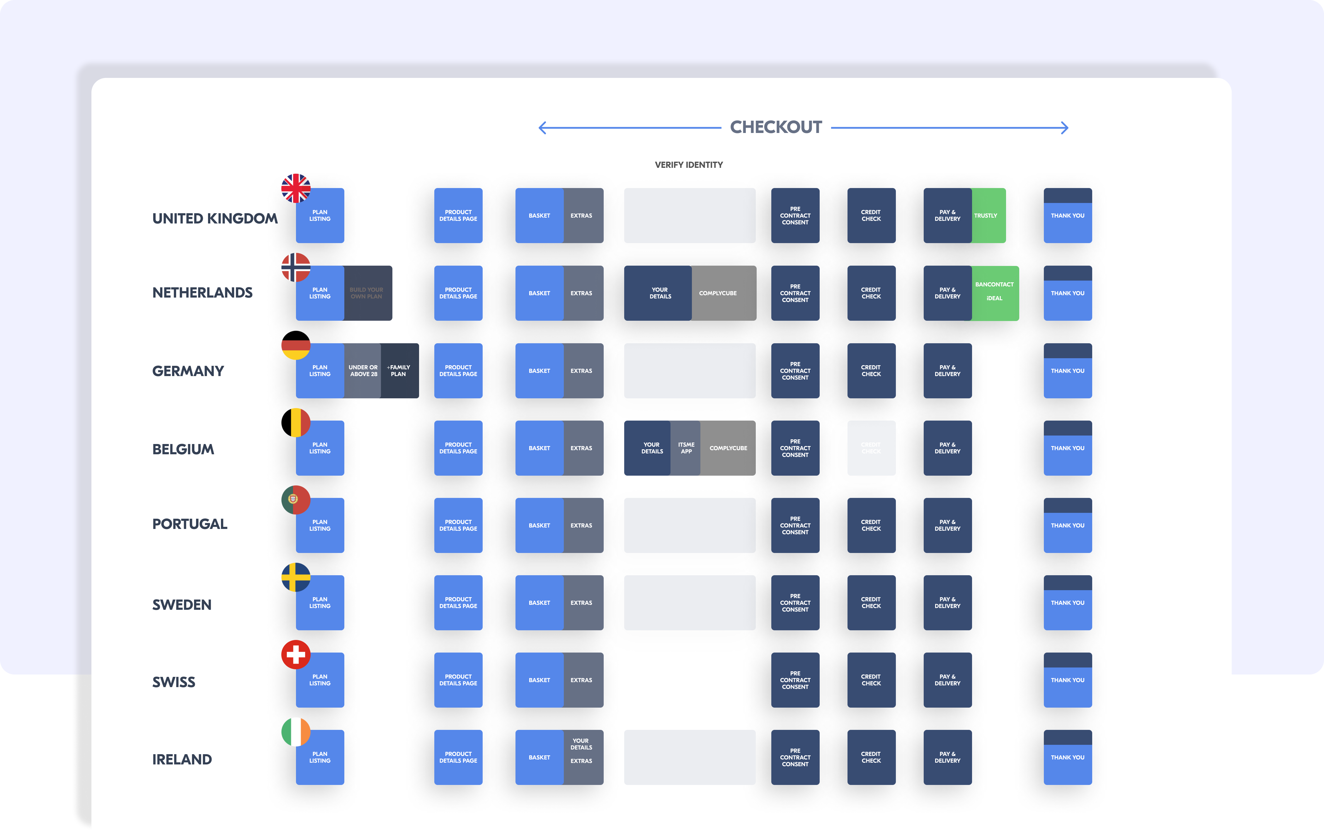
With distinct order journey for Pay monthly and also with business planning to launch in 16+ countries, this became a complex UX challenge to resolve. With the user insights, business analysis and market research I arrived at the big picture that gives a good understanding for all team members to see the size of the delivery.


The design system and core styles have been thoughtfully revamped to align with two key goals: establishing a distinct identity for our new product line and incorporating valuable feedback received over the past six months since the site's launch.
Here's what’s new:
Fresh color palette for the new product line: We introduced a sophisticated stone and purple theme to give the product line its own unique character.
Typography updates: Font mappings and spacing across various elements have been refined for improved readability and a polished look.
Enhanced grid system: A redesigned grid structure ensures a more seamless experience across devices, offering better aesthetics and functionality
Updated navigation:The UK market has a very standard way of naming and categorising products. Introduction of a new product line had significant impact on the navigation. We had to tweak our current navigation to align with a more standard approachPrioritise pay monthly linksUpdate nomenclature to include SEO friendly terms.
The existing tabs approach was replaced with a much more prominent and visually pleasing category selector

The design was implemented using the new tech react JS platform for UK & France.
The design resembles a neatly organized bookshelf, ensuring all essential details are presented clearly and remain visually appealing—even when translated into longer European languages

Pay monthly eco-system saw a successful launch in the UK where sales continue to grow. The overall user journeys have been appreciated across the board and has seen very few drops in funnel which can directly be attributed to a design flaws.
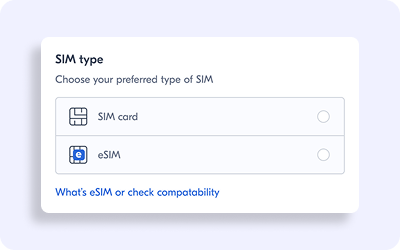
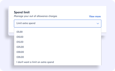
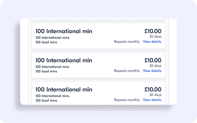
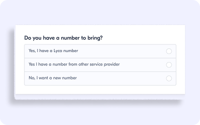
Opting for a SIM-only pay-monthly contract offers a distinctly different experience compared to a prepaid plan. Customers in this space tend to demonstrate a higher level of commitment, often providing more personal details upfront. We did a market survey and compiled a list of possible steps applicable in the respective regions.

The configurable basket.The basket itself presents a choice of a configurable steps based on the market
Key driving principles.
We prioritised three core principles: progressive disclosure, intuitive recognition, and enhanced configurability.
These principles guided the design of a step-by-step journey, making it both efficient and engaging for the customer
The design system and core styles have been thoughtfully revamped to align with two key goals: establishing a distinct identity for our new product line and incorporating valuable feedback received over the past six months since the site's launch.
Here's what’s new:
Fresh color palette for the new product line.
We introduced a sophisticated stone and purple theme to give the product line its own unique character
Typography updates.
Font mappings and spacing across various elements have been refined for improved readability and a polished look
Enhanced grid system.
A redesigned grid structure ensures a more seamless experience across devices, offering better aesthetics and functionality
In order to present the new product line and create focus on Pay monthly we did a few changes to the home page of the website
Here's what’s new:
Updated navigation
The UK market has a very standard way of naming and categorising products. Introduction of a new product line had significant impact on the navigation. We had to tweak our current navigation to align with a more standard approachPrioritise pay monthly linksUpdate nomenclature to include SEO friendly terms
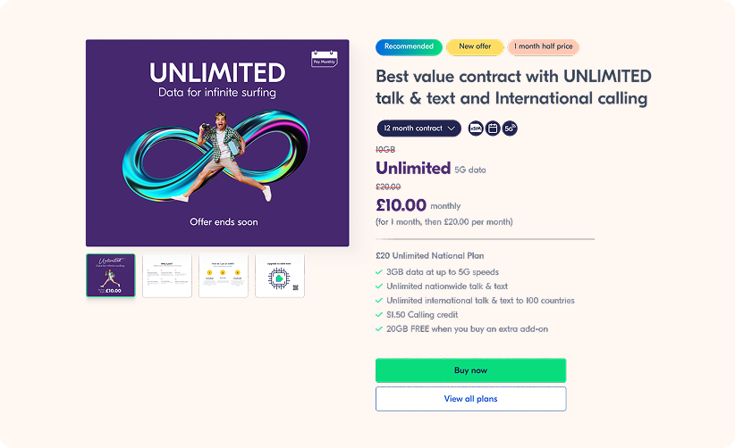
Masthead banner
Lead with Pay monthly productsLimit to only 3 with last one being a prepaid product
Mid-page product showcase
Market more Pay monthly products(3:1)

The product listing page is where customers explore various product options and compare prices to make their final decision. This page plays a key role in the marketing strategy, especially when promoting a specific product. To align with this strategy, the design enhancements focused on the following improvements
Improved ability to show Offer price, Offer period & additional data benefits Enhanced visibility of offer prices, offer periods, and additional benefits to attract customer attention


The product details page is thoughtfully crafted to provide comprehensive information about the plan, terms, and conditions, while strategically reinforcing the customer's confidence in their purchase through engaging marketing techniques
New tags & icons to highlight product characteristics
Introduced new tags and icons to highlight key product features, making it easier for customers to spot the most relevant details
Improved category selector
The existing tabs approach was replaced with a much more prominent and visually pleasing category selector

The design resembles a neatly organised bookshelf, ensuring all essential details are presented clearly and remain visually appealing—even when translated into longer European languages
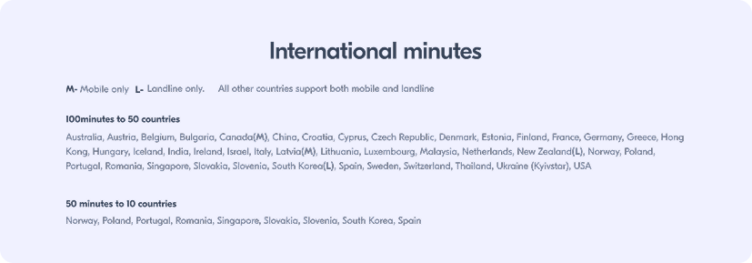
Streamlined International Calling Listing
Recognizing the importance of the international calling feature for customers, the listing was revamped to enhance readability and usability. The previous design, while visually engaging, was cluttered with unnecessary UI patterns such as icons, accordions, and tabs. These were replaced with a simplified, text-based sequential format, making it easier for users to scroll through and find the information they need.This streamlined approach prioritizes clarity and user experience, creating a page that is both functional and aesthetically pleasing
#1 Guide the user with better error responses
Over time, we noticed that many error messages generated by our system weren’t very helpful for users. These messages often reflected internal checks but didn’t clearly explain the problem or what to do about it. To improve the user experience, we decided to update these messages to focus on two key aspects:
1. Explaining what the error means for the user in simple, everyday language.
2. Providing clear next steps the user can take to resolve the issue.
This approach ensures that users feel informed and guided whenever they encounter an issue, making the experience smoother and less frustrating.
#2 The case for a streamlined onboarding flow
The initial onboarding flow was comprehensive, covering every aspect from product configurations to optional features like number selection. However, the Netherlands launch highlighted a clear need for a faster, simplified alternative. This revised approach would focus solely on essentials, offering a preconfigured bundle without add-ons, additional settings, or a credit check—prioritising speed and ease for a smoother user experience.
#3 Need for a separate ‘Prepaid’ to ‘Pay monthly’ upgrade journey
The introduction of a dedicated Prepaid-to-Postpaid migration journey has long been a priority for us as the next logical evolution. Given that existing prepaid customers require fewer steps and details during the transition, a tailored and streamlined process was essential to enhance their experience.
Shout-outs
A huge thanks to everyone involved in this exciting transformation - Designers, Analytics team, Country managers, Customer support team and Development teams


